本文介绍了
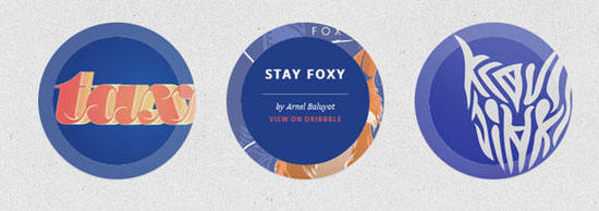
在今天的教程中,我们将在圆上试验悬停效果。 自从有了border- radius属性,我们可以创建圆形形状,并且它们作为设计元素更常出现在网站中。 我特别喜欢看到的一个用途是圆形缩略图,它看起来比通常的矩形更有趣。 因为圆是如此特殊的形状,我们将为它创造一些特殊的悬停效果!
我们将在本教程中省略浏览器前缀。 但你当然会在下载文件中找到它们。
那么,让我们开始吧!
HTML结构
对于大多数示例,我们将使用以下结构:
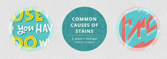
<ul class="ch-grid">
	<li>
		<div class="ch-item ch-img-1">
			<div class="ch-info">
				<h3>Use what you have</h3>
				<p>by Angela Duncan <a href="http://drbl.in/eOPF">View on Dribbble</a></p>
			</div>
		</div>
	</li>
	<li>
		<div class="ch-item ch-img-2">
			<div class="ch-info">
				<h3>Common Causes of Stains</h3>
				<p>by Antonio F. Mondragon <a href="http://drbl.in/eKMi">View on Dribbble</a></p>
			</div>
		</div>
	</li>
	<li>
		<div class="ch-item ch-img-3">
			<div class="ch-info">
				<h3>Pink Lightning</h3>
				<p>by Charlie Wagers <a href="http://drbl.in/ekhp">View on Dribbble</a></p>
			</div>
		</div>
	</li>
</ul>
虽然我们可以在这里使用图像,但我们会通过使用背景图像来给自己更多的选择。 我们将在以“ch-img-”开头的类中定义它们。
现在,让我们做一些悬停效果吧!
CSS样式
让我们为列表和列表项定义一些常见的样式:
.ch-grid {
	margin: 20px 0 0 0;
	padding: 0;
	list-style: none;
	display: block;
	text-align: center;
	width: 100%;
}

.ch-grid:after,
.ch-item:before {
	content: '';
    display: table;
}

.ch-grid:after {
	clear: both;
}

.ch-grid li {
	width: 220px;
	height: 220px;
	display: inline-block;
	margin: 20px;
}
一些示例将具有不同的结构,但我们将更详细地研究每个示例。
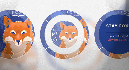
示例1
第一个例子是通过缩放来揭示描述,我们还将为".ch-item"的内阴影设置动画。 所以让我们定位".ch-item"并设置一个漂亮的,内阴影和过渡:
.ch-item {
	width: 100%;
	height: 100%;
	border-radius: 50%;
	overflow: hidden;
	position: relative;
	cursor: default;
	box-shadow:
		inset 0 0 0 16px rgba(255,255,255,0.6),
		0 1px 2px rgba(0,0,0,0.1);
	transition: all 0.4s ease-in-out;
}
正如您之前注意到的那样,我们已经为列表项提供了两个类:一个是ch-item,另一个用于定义特定的背景图像:
.ch-img-1 {
	background-image: url(../images/1.jpg);
}

.ch-img-2 {
	background-image: url(../images/2.jpg);
}

.ch-img-3 {
	background-image: url(../images/3.jpg);
}
".ch-info"将设置为绝对定位,我们将通过设置RGBA值为其提供半透明背景。 它的不透明度将设置为0,我们也将它缩小到0:
.ch-info {
	position: absolute;
	background: rgba(63,147,147, 0.8);
	width: inherit;
	height: inherit;
	border-radius: 50%;
	overflow: hidden;
	opacity: 0;
	transition: all 0.4s ease-in-out;
	transform: scale(0);
}
标题将具有一些padding和margin以及平滑的文本阴影:
.ch-info h3 {
	color: #fff;
	text-transform: uppercase;
	letter-spacing: 2px;
	font-size: 22px;
	margin: 0 30px;
	padding: 45px 0 0 0;
	height: 140px;
	font-family: 'Open Sans', Arial, sans-serif;
	text-shadow:
		0 0 1px #fff,
		0 1px 2px rgba(0,0,0,0.3);
}
p元素的不透明度为0和一个过渡(我们希望在悬停时将其淡入但有延迟时间):
.ch-info p {
	color: #fff;
	padding: 10px 5px;
	font-style: italic;
	margin: 0 30px;
	font-size: 12px;
	border-top: 1px solid rgba(255,255,255,0.5);
	opacity: 0;
	transition: all 1s ease-in-out 0.4s;
}
链接将使用大写字母,我们将悬停颜色设置为黄色:
.ch-info p a {
	display: block;
	color: rgba(255,255,255,0.7);
	font-style: normal;
	font-weight: 700;
	text-transform: uppercase;
	font-size: 9px;
	letter-spacing: 1px;
	padding-top: 4px;
	font-family: 'Open Sans', Arial, sans-serif;
}

.ch-info p a:hover {
	color: rgba(255,242,34, 0.8);
}
现在,有趣的悬停动作! ".ch-item"的内阴影的尺寸从16px设置为1px:
.ch-item:hover {
	box-shadow:
		inset 0 0 0 1px rgba(255,255,255,0.1),
		0 1px 2px rgba(0,0,0,0.1);
}
".ch-info"将淡入并缩放到1:
.ch-item:hover .ch-info {
	transform: scale(1);
	opacity: 1;
}
描述的段落p将会淡入(延迟):
.ch-item:hover .ch-info p {
	opacity: 1;
}
这是第一个例子! 我们来看看下一个。
示例2
此示例中的HTML结构与第一个中的HTML结构相同。
在这个例子中,我们将使用".ch-item"的阴影来填充我们的圆并作为描述的背景。 所以,这里没什么特别的,只是多了一个阴影值:
.ch-item {
	width: 100%;
	height: 100%;
	border-radius: 50%;
	position: relative;
	cursor: default;
	box-shadow:
		inset 0 0 0 0 rgba(200,95,66, 0.4),
		inset 0 0 0 16px rgba(255,255,255,0.6),
		0 1px 2px rgba(0,0,0,0.1);
	transition: all 0.4s ease-in-out;
}
背景图像:
.ch-img-1 {
	background-image: url(../images/4.jpg);
}

.ch-img-2 {
	background-image: url(../images/5.jpg);
}

.ch-img-3 {
	background-image: url(../images/6.jpg);
}
".ch-info"将再次缩放:
.ch-info {
	position: absolute;
	width: 100%;
	height: 100%;
	border-radius: 50%;
	overflow: hidden;
	opacity: 0;
	transition: all 0.4s ease-in-out;
	transform: scale(0);
	backface-visibility: hidden;
}
让我们设计文本元素的风格:
.ch-info h3 {
	color: #fff;
	text-transform: uppercase;
	position: relative;
	letter-spacing: 2px;
	font-size: 22px;
	margin: 0 30px;
	padding: 65px 0 0 0;
	height: 110px;
	font-family: 'Open Sans', Arial, sans-serif;
	text-shadow:
		0 0 1px #fff,
		0 1px 2px rgba(0,0,0,0.3);
}

.ch-info p {
	color: #fff;
	padding: 10px 5px;
	font-style: italic;
	margin: 0 30px;
	font-size: 12px;
	border-top: 1px solid rgba(255,255,255,0.5);
}

.ch-info p a {
	display: block;
	color: rgba(255,255,255,0.7);
	font-style: normal;
	font-weight: 700;
	text-transform: uppercase;
	font-size: 9px;
	letter-spacing: 1px;
	padding-top: 4px;
	font-family: 'Open Sans', Arial, sans-serif;
}

.ch-info p a:hover {
	color: rgba(255,242,34, 0.8);
}
在悬停时,我们会将内阴影(偏红的阴影)设置为110px展开半径。 这将涵盖所有的圆:
.ch-item:hover {
	box-shadow:
		inset 0 0 0 110px rgba(200,95,66, 0.4),
		inset 0 0 0 16px rgba(255,255,255,0.8),
		0 1px 2px rgba(0,0,0,0.1);
}
我们将缩放".ch-info"并淡化它:
.ch-item:hover .ch-info {
	opacity: 1;
	transform: scale(1);
}
示例3
在这个例子中,我们将使用旋转。 结构将与前两个示例略有不同,因为我们需要将".ch-thumb"添加为第二个分区。 所以列表项看起来如下:
<li>
	<div class="ch-item">
		<div class="ch-info">
			<h3>Music poster</h3>
			<p>by Jonathan Quintin <a href="http://drbl.in/eGjw">View on Dribbble</a></p>
		</div>
		<div class="ch-thumb ch-img-1"></div>
	</div>
</li>
".ch-item"的样式将与之前一样(带有微妙的阴影):
.ch-item {
	width: 100%;
	height: 100%;
	border-radius: 50%;
	position: relative;
	cursor: default;
	box-shadow: 0 1px 3px rgba(0,0,0,0.2);
}
".ch-thumb"元素将具有特定的变换原点(位于右中间的某个位置)和过渡。 这将是我们想要在悬停时向下旋转的元素,以便它显示".ch-info"元素:
.ch-thumb {
	width: 100%;
	height: 100%;
	border-radius: 50%;
	overflow: hidden;
	position: absolute;
	box-shadow: inset 0 0 0 15px rgba(255,255,255, 0.5);
	transform-origin: 95% 40%;
	transition: all 0.3s ease-in-out;
}
使用伪类:创建一个带有径向渐变的小黄铜紧固件:
.ch-thumb:after {
	content: '';
	width: 8px;
	height: 8px;
	position: absolute;
	border-radius: 50%;
	top: 40%;
	left: 95%;
	margin: -4px 0 0 -4px;
	background: radial-gradient(ellipse at center, rgba(14,14,14,1) 0%,rgba(125,126,125,1) 100%);
	box-shadow: 0 0 1px rgba(255,255,255,0.9);
}
让我们为每个".ch-thumb"元素定义背景图像:
.ch-img-1 {
	background-image: url(../images/7.jpg);
	z-index: 12;
}

.ch-img-2 {
	background-image: url(../images/8.jpg);
	z-index: 11;
}

.ch-img-3 {
	background-image: url(../images/9.jpg);
	z-index: 10;
}
".ch-info"元素的样式如下:
.ch-info {
	position: absolute;
	width: inherit;
	height: inherit;
	border-radius: 50%;
	overflow: hidden;
	background: #c9512e url(../images/noise.png);
	box-shadow: inset 0 0 0 5px rgba(0,0,0,0.05);
}
文本元素将按以下方式定位和设置样式:
.ch-info h3 {
	color: #fff;
	text-transform: uppercase;
	position: relative;
	letter-spacing: 2px;
	font-size: 18px;
	margin: 0 60px;
	padding: 22px 0 0 0;
	height: 85px;
	font-family: 'Open Sans', Arial, sans-serif;
	text-shadow:
		0 0 1px #fff,
		0 1px 2px rgba(0,0,0,0.3);
}

.ch-info p {
	color: #fff;
	padding: 10px 5px;
	font-style: italic;
	margin: 0 30px;
	font-size: 12px;
	border-top: 1px solid rgba(255,255,255,0.5);
}
链接将是一个小圆圈,应该在悬停时从右侧移入:
.ch-info p a {
	display: block;
	color: #333;
	width: 80px;
	height: 80px;
	background: rgba(255,255,255,0.3);
	border-radius: 50%;
	color: #fff;
	font-style: normal;
	font-weight: 700;
	text-transform: uppercase;
	font-size: 9px;
	letter-spacing: 1px;
	padding-top: 24px;
	margin: 7px auto 0;
	font-family: 'Open Sans', Arial, sans-serif;
	opacity: 0;
	transition:
		transform 0.3s ease-in-out 0.2s,
		opacity 0.3s ease-in-out 0.2s,
		background 0.2s linear 0s;
	transform: translateX(60px) rotate(90deg);
}

.ch-info p a:hover {
	background: rgba(255,255,255,0.5);
}
由于我们希望移动和不透明度发生延迟,但背景悬停没有过渡,我们将分离过渡。
在悬停时,我们将旋转".ch-thumb"并移动/旋转链接元素:
.ch-item:hover .ch-thumb {
	box-shadow: inset 0 0 0 15px rgba(255,255,255, 0.5), 0 1px 3px rgba(0,0,0,0.2);
	transform: rotate(-110deg);
}
.ch-item:hover .ch-info p a{
	opacity: 1;
	transform: translateX(0px) rotate(0deg);
}
示例4

第四个例子将涉及一些3D旋转。 因此,我们需要调整结构,以便有一个容器用于透视和前面和后面。 因此,列表项将如下所示:
<li>
	<div class="ch-item ch-img-1">
		<div class="ch-info-wrap">
			<div class="ch-info">
				<div class="ch-info-front ch-img-1"></div>
				<div class="ch-info-back">
					<h3>Bears Type</h3>
					<p>by Josh Schott <a href="http://drbl.in/ewUW">View on Dribbble</a></p>
				</div>
			</div>
		</div>
	</div>
</li>
如您所见,我们将背景图像添加到".ch-item"以及".ch-info-front"。 诀窍是给".ch-info-wrap"提供相同的背景。
这将产生幻觉,好像我们的".ch-item"有一个洞。
".ch-item"将具有以下的样式:
.ch-item {
	width: 100%;
	height: 100%;
	border-radius: 50%;
	position: relative;
	box-shadow: 0 1px 2px rgba(0,0,0,0.1);
	cursor: default;
}
".ch-info-wrap"将有透视属性,我们还将添加阴影的过渡:
.ch-info-wrap{
	position: absolute;
	width: 180px;
	height: 180px;
	border-radius: 50%;
	perspective: 800px;
	transition: all 0.4s ease-in-out;
	top: 20px;
	left: 20px;
	background: #f9f9f9 url(../images/bg.jpg);
	box-shadow:
		0 0 0 20px rgba(255,255,255,0.2),
		inset 0 0 3px rgba(115,114, 23, 0.8);

}
".ch-info"将需要preserve-3d值用于变换样式,我们将给它一个过渡,因为这是我们将在3d中旋转的元素:
.ch-info{
	position: absolute;
	width: 180px;
	height: 180px;
	border-radius: 50%;
	transition: all 0.4s ease-in-out;
	transform-style: preserve-3d;
}
正面和背面将具有以下常见样式:
.ch-info > div {
	display: block;
	position: absolute;
	width: 100%;
	height: 100%;
	border-radius: 50%;
	background-position: center center;
	backface-visibility: hidden;
}
背面将旋转,以便我们开始不会看到它:
.ch-info .ch-info-back {
	transform: rotate3d(0,1,0,180deg);
	background: #000;
}
再次,背景图片:
.ch-img-1 {
	background-image: url(../images/10.jpg);
}

.ch-img-2 {
	background-image: url(../images/11.jpg);
}

.ch-img-3 {
	background-image: url(../images/12.jpg);
}
...和文本元素:
.ch-info h3 {
	color: #fff;
	text-transform: uppercase;
	letter-spacing: 2px;
	font-size: 14px;
	margin: 0 15px;
	padding: 40px 0 0 0;
	height: 90px;
	font-family: 'Open Sans', Arial, sans-serif;
	text-shadow:
		0 0 1px #fff,
		0 1px 2px rgba(0,0,0,0.3);
}

.ch-info p {
	color: #fff;
	padding: 10px 5px;
	font-style: italic;
	margin: 0 30px;
	font-size: 12px;
	border-top: 1px solid rgba(255,255,255,0.5);
}

.ch-info p a {
	display: block;
	color: rgba(255,255,255,0.7);
	font-style: normal;
	font-weight: 700;
	text-transform: uppercase;
	font-size: 9px;
	letter-spacing: 1px;
	padding-top: 4px;
	font-family: 'Open Sans', Arial, sans-serif;
}

.ch-info p a:hover {
	color: rgba(255,242,34, 0.8);
}
在悬停时,我们将更改".ch-info-wrap"的阴影并旋转".ch-info",以便我们看到背面:
.ch-item:hover .ch-info-wrap {
	box-shadow:
		0 0 0 0 rgba(255,255,255,0.8),
		inset 0 0 3px rgba(115,114, 23, 0.8);
}

.ch-item:hover .ch-info {
	transform: rotate3d(0,1,0,-180deg);
}
示例5
在此示例中,我们希望将".ch-thumb"缩小为0,并通过将其淡入并将其缩小为1来显示".ch-info"。 第五示例的结构与前一示例中的相同。
该".ch-item"具有以下的风格:
.ch-item {
	width: 100%;
	height: 100%;
	border-radius: 50%;
	position: relative;
	box-shadow: 0 1px 2px rgba(0,0,0,0.1);
	cursor: default;
}
".ch-info-wrap"和".ch-info"将具有以下常见样式:
.ch-info-wrap,
.ch-info{
	position: absolute;
	width: 180px;
	height: 180px;
	border-radius: 50%;
}
让我们通过将相同的背景设置给".ch-info-wrap"来再次执行“漏洞”技巧:
.ch-info-wrap {
	top: 20px;
	left: 20px;
	background: #f9f9f9 url(../images/bg.jpg);
	box-shadow:
		0 0 0 20px rgba(255,255,255,0.2),
		inset 0 0 3px rgba(115,114, 23, 0.8);

}
常见的样式是“前面”和“背面”(它不再是正面和背面):
.ch-info > div {
	display: block;
	position: absolute;
	width: 100%;
	height: 100%;
	border-radius: 50%;
	background-position: center center;
}
“前面”将有一个过渡(它会缩小并消失):
.ch-info .ch-info-front {
	transition: all 0.6s ease-in-out;
}
".ch-info-back"最初将具有0不透明度并且可以扩展到1.5:
.ch-info .ch-info-back {
	opacity: 0;
	background: #223e87;
	pointer-events: none;
	transform: scale(1.5);
	transition: all 0.4s ease-in-out 0.2s;
}
我们需要将pointer-events设置为none,因为我们不希望元素“阻塞”其他所有内容...记住,它被放大,我们因为它的不透明性而无法看到它,但它仍然存在。
像往常一样的背景图像和文本元素,只是有一些不同的颜色:
.ch-img-1 {
	background-image: url(../images/13.jpg);
}

.ch-img-2 {
	background-image: url(../images/14.jpg);
}

.ch-img-3 {
	background-image: url(../images/15.jpg);
}

.ch-info h3 {
	color: #fff;
	text-transform: uppercase;
	letter-spacing: 2px;
	font-size: 18px;
	margin: 0 15px;
	padding: 40px 0 0 0;
	height: 80px;
	font-family: 'Open Sans', Arial, sans-serif;
	text-shadow:
		0 0 1px #fff,
		0 1px 2px rgba(0,0,0,0.3);
}

.ch-info p {
	color: #fff;
	padding: 10px 5px 0;
	font-style: italic;
	margin: 0 30px;
	font-size: 12px;
	border-top: 1px solid rgba(255,255,255,0.5);
}

.ch-info p a {
	display: block;
	color: #e7615e;
	font-style: normal;
	font-weight: 700;
	text-transform: uppercase;
	font-size: 9px;
	letter-spacing: 1px;
	padding-top: 4px;
	font-family: 'Open Sans', Arial, sans-serif;
}

.ch-info p a:hover {
	color: #fff;
}
在悬停时,我们将缩小".ch-info-front"部分为0并将不透明度设置为0.这将使其消失在后面。
.ch-item:hover .ch-info-front {
	transform: scale(0);
	opacity: 0;
}
".ch-info-back"将缩小为1并淡入。我们还将pointer event事件设置为auto,因为现在我们希望能够单击链接:
.ch-item:hover .ch-info-back {
	transform: scale(1);
	opacity: 1;
	pointer-events: auto;
}
示例6
在此示例中,我们希望向下翻转内部".ch-thumb"部分以显示描述。 HTML将与前两个示例中的相同。
".ch-item"将按以前的样式设置:
.ch-item {
	width: 100%;
	height: 100%;
	border-radius: 50%;
	position: relative;
	box-shadow: 0 1px 2px rgba(0,0,0,0.1);
	cursor: default;
}
The common style of the wrapper and the description element:
".ch-info-wrap", ".ch-info"元素的通用样式:
.ch-info-wrap,
.ch-info{
	position: absolute;
	width: 180px;
	height: 180px;
	border-radius: 50%;
	transition: all 0.4s ease-in-out;
}
".ch-info-wrap"将具有透视:
.ch-info-wrap {
	top: 20px;
	left: 20px;
	background: #f9f9f9 url(../images/bg.jpg);
	box-shadow:
		0 0 0 20px rgba(255,255,255,0.2),
		inset 0 0 3px rgba(115,114, 23, 0.8);
	perspective: 800px;
}
".ch-info"元素需要以下转换样式:
.ch-info {
	transform-style: preserve-3d;
}
正面和背面将有一个过渡。 请注意,这次我们不会将backface-visibility设置为hidden,因为我们希望".ch-thumb"的背面在我们向下翻转时显示:
.ch-info > div {
	display: block;
	position: absolute;
	width: 100%;
	height: 100%;
	border-radius: 50%;
	background-position: center center;
	transition: all 0.6s ease-in-out;
}
让我们设置正确的transform-origin,以便我们可以打开它:
.ch-info .ch-info-front {
	transform-origin: 50% 100%;
	z-index: 100;
	box-shadow:
		inset 2px 1px 4px rgba(0,0,0,0.1);
}
我们将为".ch-info-back"设置一个0不透明度的RGBA值:
.ch-info .ch-info-back {
	background: rgba(230,132,107,0);
}
和其他元素的通常风格:
.ch-img-1 {
	background-image: url(../images/16.jpg);
}

.ch-img-2 {
	background-image: url(../images/17.jpg);
}

.ch-img-3 {
	background-image: url(../images/18.jpg);
}

.ch-info h3 {
	color: #fff;
	text-transform: uppercase;
	letter-spacing: 2px;
	font-size: 14px;
	margin: 0 25px;
	padding: 40px 0 0 0;
	height: 90px;
	font-family: 'Open Sans', Arial, sans-serif;
	text-shadow:
		0 0 1px #fff,
		0 1px 2px rgba(0,0,0,0.3);
}

.ch-info p {
	color: #fff;
	padding: 10px 5px;
	font-style: italic;
	margin: 0 30px;
	font-size: 12px;
	border-top: 1px solid rgba(255,255,255,0.5);
}

.ch-info p a {
	display: block;
	color: rgba(255,255,255,0.7);
	font-style: normal;
	font-weight: 700;
	text-transform: uppercase;
	font-size: 9px;
	letter-spacing: 1px;
	padding-top: 4px;
	font-family: 'Open Sans', Arial, sans-serif;
}

.ch-info p a:hover {
	color: rgba(255,242,34, 0.8);
}
在悬停时,我们将旋转前部并略微为阴影设置动画。 后部将以其背景颜色淡化:
.ch-item:hover .ch-info-front {
	transform: rotate3d(1,0,0,-180deg);
	box-shadow:
		inset 0 0 5px rgba(255,255,255,0.2),
		inset 0 0 3px rgba(0,0,0,0.3);
}

.ch-item:hover .ch-info-back {
	background: rgba(230,132,107,0.6);
}
示例7
最后一个示例将像旋转立方体一样,我们通过从顶部向后旋转它来显示描述。 由于我们将旋转每个面,因此我们不需要额外的父级元素。 因此,我们的HTML将如下所示:
<li>
	<div class="ch-item">
		<div class="ch-info">
			<div class="ch-info-front ch-img-1"></div>
			<div class="ch-info-back">
				<h3>Mouse</h3>
				<p>by Alexander Shumihin <a href="http://drbl.in/eAoj">View on Dribbble</a></p>
			</div>
		</div>
	</div>
</li>
我们将为".ch-item"提供透视值:
.ch-item {
	width: 100%;
	height: 100%;
	border-radius: 50%;
	position: relative;
	cursor: default;
	perspective: 900px;
}
".ch-info"将需要preserve-3d值:
.ch-info{
	position: absolute;
	width: 100%;
	height: 100%;
	transform-style: preserve-3d;
}
正面和背面将具有过渡,变换原点将设置为50%0%:
.ch-info > div {
	display: block;
	position: absolute;
	width: 100%;
	height: 100%;
	border-radius: 50%;
	background-position: center center;
	transition: all 0.4s linear;
	transform-origin: 50% 0%;
}
让我们为前面部分设置一个漂亮的内阴影:
.ch-info .ch-info-front {
	box-shadow: inset 0 0 0 16px rgba(0,0,0,0.3);
}
背面将在最初旋转,以显示为立方体的下表面:
.ch-info .ch-info-back {
	transform: translate3d(0,0,-220px) rotate3d(1,0,0,90deg);
	background: #000;
	opacity: 0;
}
背景图像和文本元素的通常风格:
.ch-img-1 {
	background-image: url(../images/19.jpg);
}

.ch-img-2 {
	background-image: url(../images/20.jpg);
}

.ch-img-3 {
	background-image: url(../images/21.jpg);
}

.ch-info h3 {
	color: #fff;
	text-transform: uppercase;
	letter-spacing: 2px;
	font-size: 24px;
	margin: 0 15px;
	padding: 60px 0 0 0;
	height: 110px;
	font-family: 'Open Sans', Arial, sans-serif;
	text-shadow:
		0 0 1px #fff,
		0 1px 2px rgba(0,0,0,0.3);
}

.ch-info p {
	color: #fff;
	padding: 10px 5px;
	font-style: italic;
	margin: 0 30px;
	font-size: 12px;
	border-top: 1px solid rgba(255,255,255,0.5);
}

.ch-info p a {
	display: block;
	color: rgba(255,255,255,0.7);
	font-style: normal;
	font-weight: 700;
	text-transform: uppercase;
	font-size: 9px;
	letter-spacing: 1px;
	padding-top: 4px;
	font-family: 'Open Sans', Arial, sans-serif;
}

.ch-info p a:hover {
	color: rgba(255,242,34, 0.8);
}
我们将使用translate3d在3d空间的Y轴上移动前部,并使用rotate3d实际旋转它。 我们也会淡出它,因为我们之后不希望看到它的任何部分:
.ch-item:hover .ch-info-front {
	transform: translate3d(0,280px,0) rotate3d(1,0,0,-90deg);
	opacity: 0;
}
背面将“向后”旋转到0度(记住,最初它向下旋转):
.ch-item:hover .ch-info-back {
	transform: rotate3d(1,0,0,0deg);
	opacity: 1;
}
就是这样! 一大堆悬停效果,允许许多不同的变化,快去尝试一下吧!
以上就是本文的全部内容,希望对大家的学习有所帮助,也希望大家多多支持。


