前几天,同事接到一个积分商城项目,其中有一个卡券兑换礼品功能。我想了一会没什么好的思路,就忙自己的项目去了。但想到以后自己可能也会遇到类似的需求,所以周末学习整理了下几种卡券效果的实现。
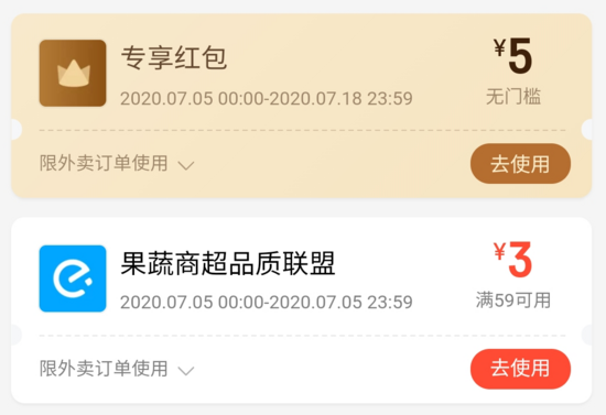
常见的卡券样式如下:
使用伪元素实现(Less 版本)
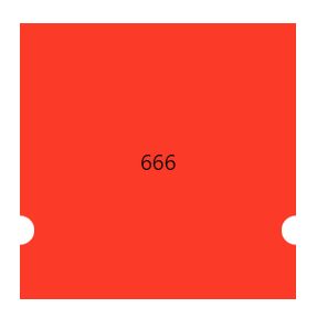
ticket.less
css;">
.ordinary-mixins-ticket-horizontal(@width,@height,@r,@top, @color) {
position: relative;
box-sizing: border-box;
padding: 0 @r;
width: @width;
height: @height;
background-clip: content-box;
background-color: @color;
&::before {
position: absolute;
top: 0;
left: 0;
content: "";
display: block;
width: @r + 1px;
height: 100%;
background: radial-gradient(@r circle at left @top, transparent @r, @color @r + 1px);
}
&::after {
position: absolute;
top: 0;
right: 0;
content: "";
display: block;
//这里的 @r + 1px 是为了避免某些百分百比缩放页面时,出现空隙
width: @r + 1px;
height: 100%;
//这里的 @r + 1px 是为了防止出现锯齿
background: radial-gradient(@r circle at right @top, transparent @r, @color @r + 1px);
}
}
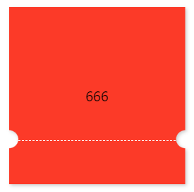
.parent {
.ordinary-mixins-ticket-horizontal(200px, 200px, 10px, 150px, #fc3a28);
}
.child {
line-height: 200px;
}
App.js
css;">
import React from 'react';
import './App.css';
import './ticket.less';

function App() {
    return (
        <div className="App" style={
            {
                display: "flex",
                justifyContent: "center",
                alignItems: "center",
                height: 600
            }
        }>
            <div className={'parent'}>
                <div className="child">666</div>
            </div>
        </div>
    );
}

export default App;
升级版样式一(Less 版本)
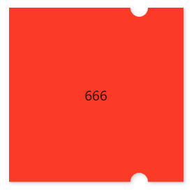
.mixins-ticket-vertical(@width, @height, @r, @left, @l-color, @r-color) {
  width: @width;
  height: @height;
  // @left - 1px 是为了避免某些百分百比缩放页面时,出现空隙
  // @r + 1px 是为了防止出现锯齿
  // 51% 是为了防止出现元素中间会有一小段空白区域的情况
  background: radial-gradient(circle at left top, transparent @r, @l-color  @r + 1px) @left - 1px top ~'/' 100% 51% no-repeat,
  radial-gradient(circle at left bottom, transparent @r, @l-color  @r + 1px) @left - 1px bottom ~'/' 100% 51% no-repeat,
    radial-gradient(circle at  right top, transparent @r, @r-color  @r + 1px ) -(@width - @left) top ~'/' 100% 51% no-repeat,
    radial-gradient(circle at right bottom , transparent @r, @r-color  @r + 1px )  -(@width - @left) bottom ~'/' 100% 51% no-repeat;

  filter: drop-shadow(2px 2px 2px rgba(0, 0, 0, .2));
}

.mixins-ticket-vertical-two(@width, @height, @r, @left, @l-color, @r-color) {
  width: @width;
  height: @height;
  // @left + 1px 是为了避免某些百分百比缩放页面时,出现空隙
  // @r + 1px 是为了防止出现锯齿
  // 51% 是为了防止出现元素中间会有一小段空白区域的情况
  background: radial-gradient(circle at left top, transparent @r, @r-color @r + 1px) right top ~'/' (@width - @left) 51% no-repeat,
  radial-gradient(circle at left bottom, transparent @r, @l-color @r + 1px) right bottom ~'/' (@width - @left)   51% no-repeat,
  radial-gradient(circle at right top, transparent @r, @r-color @r + 1px) left top ~'/' @left + 1px 51% no-repeat,
  radial-gradient(circle at right bottom, transparent @r, @l-color @r + 1px) left bottom ~'/' @left + 1px   51% no-repeat;

  filter: drop-shadow(2px 2px 2px rgba(0, 0, 0, .2));
}

.parent {
  .mixins-ticket-vertical(200px, 200px, 10px, 150px, #fc3a28,#fc3a28);
  //.mixins-ticket-vertical-two(200px, 200px, 10px, 150px, #fc3a28,#fc3a28);
}
.child {
  line-height: 200px;
}
升级版样式一(Scss 版本)
@mixin mixins-ticket-vertical($width, $height, $r, $left, $l-color, $r-color) {
  width: $width;
  height: $height;
  // $left - 1px 是为了避免某些百分百比缩放页面时,出现空隙
  // $r + 1px 是为了防止出现锯齿
  // 51% 是为了防止出现元素中间会有一小段空白区域的情况
  background: radial-gradient(circle at left top, transparent $r, $l-color  $r + 1px) $left - 1px top / 100% 51% no-repeat,
  radial-gradient(circle at left bottom, transparent $r, $l-color  $r + 1px) $left - 1px bottom / 100% 51% no-repeat,
  radial-gradient(circle at  right top, transparent $r, $r-color  $r + 1px ) -($width - $left) top / 100% 51% no-repeat,
  radial-gradient(circle at right bottom , transparent $r, $r-color  $r + 1px )  -($width - $left) bottom / 100% 51% no-repeat;

  filter: drop-shadow(2px 2px 2px rgba(0, 0, 0, .2));
}

.parent {
  @include mixins-ticket-vertical(200px, 200px, 10px, 150px, #fc3a28, #fc3a28);
}

.child {
  line-height: 200px;
}
升级版样式二(Less 版本)
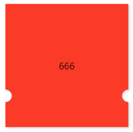
.mixins-ticket-horizontal(@width, @height, @r, @top, @l-color, @r-color) {
  width: @width;
  height: @height;
  background: radial-gradient(circle at left top, transparent @r, @l-color @r + 1px) left  @top - 1px ~'/' 51% 100% no-repeat,
  radial-gradient(circle at left bottom, transparent @r, @l-color @r + 1px) left -(@height - @top) ~'/' 51% 100% no-repeat,
  radial-gradient(circle at right top, transparent @r, @r-color @r + 1px) right  @top - 1px ~'/' 51% 100% no-repeat,
  radial-gradient(circle at right bottom, transparent @r, @r-color @r + 1px) right -(@height - @top) ~'/' 51% 100% no-repeat;

  filter: drop-shadow(2px 2px 2px rgba(0, 0, 0, .2));
}

.mixins-ticket-horizontal-two(@width, @height, @r, @top, @l-color, @r-color) {
  width: @width;
  height: @height;
  background: radial-gradient(circle at left top, transparent @r, @r-color @r + 1px) left bottom ~'/' 51%  (@height - @top) no-repeat,
  radial-gradient(circle at left bottom, transparent @r, @l-color @r + 1px) left top ~'/' 51%  @top + 1px  no-repeat,
  radial-gradient(circle at right top, transparent @r, @r-color @r + 1px) right bottom ~'/' 51%  (@height - @top) no-repeat,
  radial-gradient(circle at right bottom, transparent @r, @l-color @r + 1px) right top ~'/' 51% @top + 1px no-repeat;

  filter: drop-shadow(2px 2px 2px rgba(0, 0, 0, .2));
}

.parent {
  .mixins-ticket-horizontal(200px, 200px, 10px, 150px, #fc3a28,#fc3a28);
  //.mixins-ticket-horizontal-two(200px, 200px, 10px, 150px, #fc3a28,#fc3a28);
}
.child {
  line-height: 200px;
}
升级版样式三(Less 版本)
.mixins-ticket-horizontal-line(@width, @height, @r, @top, @l-color, @r-color,@border-offset,@border-color) {
  width: @width;
  height: @height;
  background: radial-gradient(circle at left top, transparent @r, @l-color @r + 1px) left @top - 1px ~'/' 51% 100% no-repeat,
  radial-gradient(circle at left bottom, transparent @r, @l-color @r + 1px) left -(@height - @top) ~'/' 51% 100% no-repeat,
  radial-gradient(circle at right top, transparent @r, @r-color @r + 1px) right @top - 1px ~'/' 51% 100% no-repeat,
  radial-gradient(circle at right bottom, transparent @r, @r-color @r + 1px) right -(@height - @top) ~'/' 51% 100% no-repeat;
  filter: drop-shadow(2px 2px 2px rgba(0, 0, 0, .2));

  &::after {
    position: absolute;
    left: 0;
    right: 0;
    top: @top;
    margin: auto;
    content: '';
    width: calc(~"100%" - 2*@r - @border-offset);
    border-top: 1px dashed @border-color;
  }
}

.parent {
  .mixins-ticket-horizontal(200px, 200px, 10px, 150px, #fc3a28,#fc3a28);
  //.mixins-ticket-horizontal-two(200px, 200px, 10px, 150px, #fc3a28,#fc3a28);
}
.child {
  line-height: 200px;
}
升级版样式四(Less 版本)
.mixins-ticket-vertical-three(@width, @height, @r, @left, @l-color, @r-color,@sm-r,@sm-offset,@sm-color) {
  width: @width;
  height: @height;
  // @left - 1px 是为了避免某些百分百比缩放页面时,出现空隙
  // @r + 1px 是为了防止出现锯齿
  // 51% 是为了防止出现元素中间会有一小段空白区域的情况
  background: radial-gradient(circle at left top, transparent @r, @l-color  @r + 1px) @left - 1px top ~'/' 100% 51% no-repeat,
  radial-gradient(circle at left bottom, transparent @r, @l-color  @r + 1px) @left - 1px bottom ~'/' 100% 51% no-repeat,
    radial-gradient(circle at  right top, transparent @r, @r-color  @r + 1px ) -(@width - @left) top ~'/' 100% 51% no-repeat,
    radial-gradient(circle at right bottom , transparent @r, @r-color  @r + 1px )  -(@width - @left) bottom ~'/' 100% 51% no-repeat;

  filter: drop-shadow(2px 2px 2px rgba(0, 0, 0, .2));

  &::after {
    content: '';
    position: absolute;
    top: 0;
    right: -@sm-r;
    width: @sm-r;
    height: 100%;
    background-image: radial-gradient(circle at @sm-r, transparent @sm-r, @r-color @sm-r + 1px);
    //background-size: @sm-r;
    background-size: @sm-r @sm-offset;
  }
}

.parent {
  .mixins-ticket-vertical-three(200px, 200px, 10px, 150px, #fc3a28, #fc3a28,5px,20px,#fc3a28);
}

.child {
  line-height: 200px;
}
注意事项
// ticket.less

//background: radial-gradient(circle at top right, transparent @r, @lcolor 0) -(@width - @left) top ~'/' 100% 55% no-repeat;
// 将上面的这行代码拆解如下:
//background-image: radial-gradient(circle at top right, transparent @r, @lcolor 0);
//background-position:-(@width - @left) top ;
//background-size:100% 55% ;
//background-repeat: no-repeat;

/*注意:这里先是有 50px 的透明区域,紧接着第二个区域设置了 0 ,可以理解为从这里开始重新设置样式区间*/
/*background: radial-gradient(circle at top right, transparent 50px, red 0, #66a8ff 50%);*/

/*在Chrome下,如果两个区域之间颜色直接以 0 偏差过渡,会有比较严重的锯齿*/
/*background: radial-gradient(10px at left,transparent 50%,#F6327C 50%);*/
/*background: radial-gradient(10px at left,transparent 50%,#F6327C 55%);*/

/*加阴影效果*/
/*filter: drop-shadow(2px 2px 2px rgba(0,0,0,.2));*/

/*多个径向渐变累加*/
/*background:
radial-gradient(50px 100px ellipse, transparent 40px, yellow 41px, red 49px, transparent 50px),
radial-gradient(30px circle, red, red 29px, transparent 30px);*/
总结
到此这篇关于CSS 中使用径向渐变实现卡券效果的文章就介绍到这了,更多相关css 径向渐变实现卡券效果内容请搜索以前的文章或继续浏览下面的相关文章,希望大家以后多多支持!


